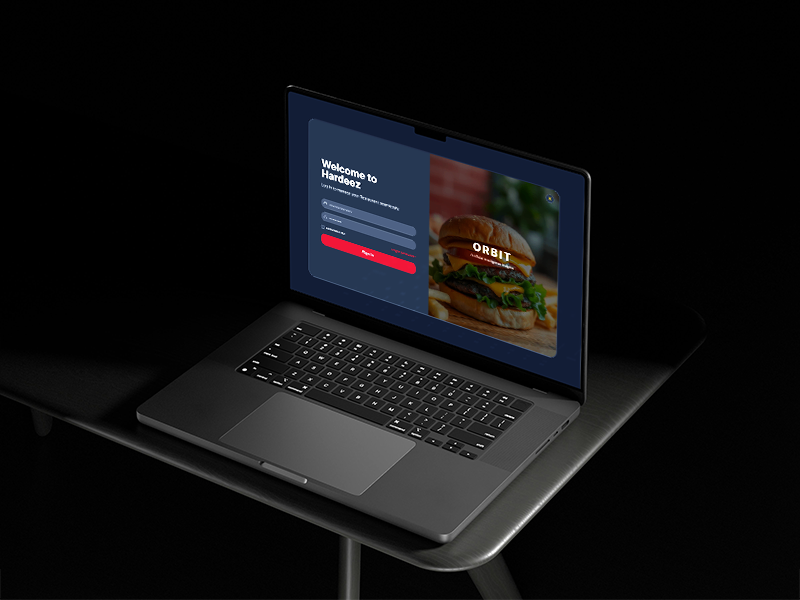
ORBIT Analytics
From Data Overload to Decision Intelligence — ~40% Faster Decision Cycles
The Challenge
“Too much data. Not enough decisions.”
The legacy ORBIT platform suffered from fragmented dashboards across modules, high cognitive load due to dense data layouts, lack of prioritization where everything looked equally important, and minimal guidance on what action to take next.
Impact on Users
Slower decision cycles across all management levels. Increased dependency on analysts for basic insight extraction. Low engagement with dashboards — managers avoided the platform entirely, reverting to manual spreadsheet analysis.
UX Strategy
The core insight: Users don’t need more data — they need direction. Every screen must answer: “What should I do next?”
Prioritize What Matters
Shift from data-heavy layouts to priority-driven dashboards. Highlight critical KPIs and anomalies first.
Reduce Cognitive Load
Chunk complex data into digestible modules. Improve scanning and comprehension speed.
Make Insights Actionable
Transform static numbers into contextual insights with recommendations.
Design for Roles
Different users have different needs. Created role-based views for Admin, Manager, Analyst, and Viewer.
Build for Scale
Established a consistent, token-driven design system for future module expansion.
The Solution
Modular Dashboard Architecture
Clean, card-based layout with logical metric grouping and progressive disclosure for deeper insights.
Insight-Driven Interface
AI-powered recommendations, contextual alerts, anomaly detection, and clear “Focus Areas” guiding user actions.
Real-Time Data Visibility
Live performance tracking, trend visualization across timeframes, and immediate feedback loops.
Personalization & Control
Custom dashboards per role, configurable widgets, and flexible data views that adapt to each user’s mental model.
Impact & Results
“Rajesh has a deep understanding of user behavior and applies user-centered design principles to solve complex business challenges. His ability to conduct usability testing, heuristic evaluations, and competitive analysis ensures that every design decision is backed by data and insights.”
— Abhimanyu Verma, Agile Coach & Transformation Consultant
Key Decisions & Trade-offs
Chose card-based progressive disclosure over dense data tables — sacrificing information density for scanability. Prioritized role-based view customization over a single universal dashboard, increasing development scope but dramatically improving adoption across management tiers. Data visualization followed “clarity over decoration”: each chart type was chosen to answer a specific business question, not just display data.
Reflection
Good dashboards show data. Great dashboards drive decisions. ORBIT evolved from a reporting tool into a decision intelligence platform, enabling users to move from analysis to action faster than ever. In retrospect, I would have introduced micro-animations for state transitions earlier — the static-to-dynamic shift caused some initial user confusion during rollout.